![]()
![]()
![]()
![]()
|
|
|
8x11 goatskin parchment 24k gold leaf Jet black ink Watercolor paint, red, blue white & black Glue Sizing |
Shaffer calligraphy pen, small tipped Cross Towsend pen, fine tipped Size 1 sable brush Scraper/burnisher ruler |
In Europe, parchment was the common material available for use in book construction prior to the 13th century. (Clement) Parchment has traditionally been made from sheepskin, and vellum from calfskin, the later being a thinner, finer product. In today’s market though there is much controversy over what constitutes "vellum" as the term means different things to a variety of experts.(Cavasin) For the purpose of this paper I shall use the more general term of "parchment". I first contacted a parchment maker to contract a sheet of 8 x 11 manuscript parchment to be made. Because of the quality of this manufacturer’s work, there was little additional preparation that needed to be done. To ensure ease of use, I gave the skin a light dusting of a fixative called "pounce". Used frequently in period pounce consists of finely ground pumice stone and gum sandarac. Pounce helps the paint adhere to the page and prevents feathering of the ink.(Seligman, 18)
All the tastes and purposes that medieval painting served made the use of metals an integral part of its technique.
Of all metals used in period illumination, gold was the most significant. Not only for its associations, its power to suggest richness and splendor, not only for its color, not only for its luster and permanence, but for all of then together. In fact the term "illumination" comes from an older term meaning "to decorate with gold". (Blackwolf) The medieval painter and/or illuminator along with his patrons joined in an enthusiasm for this precious metal that resulted in some of the most charming effects in the painting of the middle ages. For the pleasure of the patron, 23k gold patent leaf was used for the gilding. I was unable to obtain in the time required a period foundation for the gilding that would create the flat effect that I wanted. Therefor, the gold leaf is adhered to the page with a glue sizing purchased from the local craft store.Next came the time to choose my pigments. Shaffer’s Jet Black ink was used for the calligraphy and lining of the illumination. The paints that I used were a more difficult choice. Luckily, the project called for a limited number of colors. I chose to use modern commercial watercolor rather than the period Azurite, Vermilion and Lead White due to my small workspace and the highly toxic nature of most period pigments. Great care was taken to match the colors as closely as possible with the watercolors that I had available.
In period the scribes would have cut a quill for the calligraphy and gone through several a page during the process of manuscript production. For my own convenience and sanity a Shaffer cartridge pen was used for the calligraphy text, and a Shaffer Townsend with extra fine nib for the outlining. The paint and size was laid with a modern Dick Blick # 1 sable brush.
Creating the Page
Text & Calligraphy
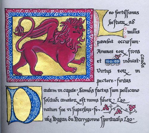
The text of the Red Winged Lion page was taken from various folios of the Aberdeen Bestiary itself. Passages chosen from the pages regarding the characteristics of the lion and the pelican have been melded together in a fashion that attempts to best personify the final recipient of the work.
Latin
"Leo fortissimus bestiarum ad nullis pavebit occursum. Animos eorum frons et cauda indicat. Virtus eorum in pectore, firitas autem in capite. Similis factus sum pellicano solitudi amatorum est nimis filiorum. Leo nature sue vi superbus, fe Duke Dagan du Darregonne spiritualis Leo."
Translation
" The lion is the mightiest of the beasts, he will quail at the approach of none. Their brow and tail show their mettle; their resolution in their head. Like a pelican in the wilderness it is devoted to it’s young. The lion takes pride in that of it’s nature. Thus Duke Sir Dagan du Darregonne, a spiritual lion."
Once my text was chosen, I picked a hand that I wanted to work in. Since the text was being done in Latin, I didn't feel that it was necessary to execute the calligraphy in a way that would be easily read by the modern eye, and was able to keep a more authentic feel to the work. Gothic Littera Bastarda or Lowborn Gothic Letters is what the patron and I finally decided upon. The Littera Bastarda hand was developed in the mid 13th century from the need for a more functional and readable script. There are many variations in this script, which makes it difficult to document. Often, one could find several different styles of this hand in the same city, mixed in with established hands of the earlier years, and expressive cursive elements from over the course of three centuries. Though commonly used for a considerable amount of the Gothic period, ultimately the difficulties of reading of Littera Bastarda left it to be abandoned for simpler Renaissance letters.
Despite the wide range of hands that this script encompasses, and the difficulties in documenting it, there are several identifying marks to Gothic Littera Bastarda, some of which I tried to emulate in this piece. Conjoined letters such as the ˝ "R", were used extensively in this style. The ˝ "R" conjoin takes place where the lower case "R" is proceeded by a letter with a right side bow such as "b". Dramatic ascenders and decenders are also prevalent in this hand. The next variation that I used was the long "S". This variation of the lower case "S" is found in stylized hands throughout the gothic period and looks much like a lowercase "F" without the cross hash.
Finally, I had to consider the punctuation in the piece. By this time in history, most all modern letters and punctuation were in use, so to add to the overall flavor and presentation, I raised the punctuation to mid-minimum height. (Drogin, 164)
I laid out the text on the computer in a rough Gothic font and printed off the copy to work from. I then highlighted the areas that needed to be changed and noted the differences in the period hand from what I had on the page.
Illumination
The illumination was sketched out according to the examples that I had done on paper. Using the base of the Pard from Aberdeen, I incorporated a curly mane for the lion, which is mentioned in the manuscript text, and added a wing such as can be found on the manuscript’s Pelican and Eagle illuminations. Once it was sketched out lightly in pencil I went over the lines with black ink.
After my calligraphy was completed, the first step in illumination of the piece was gilding. My personal gilding preference is for flat gilding, not raised, so that is the manner in which this was completed. To begin I painted on the adhesive size in a flat layer with a #1 sable brush every place that the gold leaf should stick. After the size was dry, I exposed a sheet of leaf from the package. Gently turning over the leaf, I pulled the bottom tissue back and touch the exposed leaf to the size. The next step was to pat down the leaf on the surface with a soft brush. Repeating the process of laying the leaf, I used a fresh sheet of for patching areas with an inconsistent cover. Once the layers of gold were down I placed a sheet of glassine paper over the top of them, and applying gentle pressure went over the area making small circles with a burnisher. When I had completed burnishing, I removed the glassine, and lightly went back over the gold with a piece of parachute silk to finish the shine.
Next I laid in the colors starting with the lion and working out. After letting it dry thoroughly I shaded the lion outlining the highlighted areas with white and blending them, then doing the same with black. Finally I put in the white work around the lion and then the "D" with a small brush.
As I was finishing the shading a small drop of water fell on the page and obscured the word "cauda". After the spot dried I carefully scraped off what I could of the splotch, and burnished down the vellum. I attempted to redo the text, but I was unhappy with my results due to the texture of the surface. In keeping with the feel of the piece I added a small blue bar with white work and some tiny vines over the mistake, then relocated the word to the side of the piece.
Bibliography
"Aberdeen Bestiary",
Aberdeen University Library MS 24"Bestiary", British Royal Library Royal C XIX folio 6
Bayard, Tania; "A Medieval Home Companion, Housekeeping in the 14th Century", Harper
Perennial, New York, 1992
Blackwolf, Master Gordon; "Gilding", http://www.mtsu.edu/~kgregg/dmir/06/0605.html, 1984
Brown, Michelle P.; "Understanding Illuminated Manuscripts", J.Paul Getty Muesum, Los Angeles, 1994
Buziak, Cari; "Gilding", http://www.aon-celtic.com/cgilding.html
Cavasin, Rick; "Hand made Parchment and Vellum", http://www.niagara.com/~acavasin/rick/rcav.html, 1995-8
Clement, Richard W.; "Manuscript Books", Online Reference Book for Medieval Studies
http://orb.rhodes.edu/encyclop/culture/books/medbook1.html
Drogin, Marc; "Medieval Calligraphy: Its History and Technique", Dover Publications Inc., New York, 1980
Geddes, Jane, et al; "The Aberdeen Bestiary Project", http://www.clues.abdn.ac.uk:8080/besttest/firstpag.html
Aberdeen University Library, 1995Seligman, Patricia; "The Illuminated Alphabet", A Quatro Book, Running Press, London, 1994
Thompson, Daniel V.; "The Materials and Techniques of Medieval Painting", Dover Publications, New York, 1956
"Writing Implements," Microsoft® Encarta® Encyclopedia 2000, Microsoft Corporation,1993-1999
![]()
![]()
![]()
![]()
The content of this website is licensed under a
Creative Commons
License.
Please notify us if you use our work, so we can make note of it.
Copyright © 2002, 2003, 2004, 2005 Kristen Kirk VanTassle. This is not a corporate publication of the Society for Creative Anachronism, Inc. or of the Middle Kingdom, and does not delineate SCA policies. All original contributing artists and authors retain the copyright of certain portions of this site. For information on using photographs, articles, or artwork from this website, please contact the Lady of the Manor. For technical issues, please contact the local monk. Please respect the legal rights of our contributors, Thank you.