Conchobar's LKOA Appointment
My husband and I
played for a short while in the ECS, Inc. where he served as
the Laurel King of Arms. This scroll was in honor of his
appointment. I entered it as a masterwork, but the peerage
was unimpressed, calling it bland and boring. The skill and
concentration that it took me to achieve this scroll in the
mediums which I had chosen was immense. The research into
period documents extensive. No matter what was said about
this scroll, I consider it to be my crowning achievement, a
study in the simple elegance of period documents. The
flashed washed out the picture a bit, I'll try and get a
better shot in the future. Below you will find the main
body of my documentation I presented for the piece. It also
contained 4 appendices all written by myself, which are not
included here.
Introduction
The heart of this project lay in creating
a design that was pleasing to the patron, had the feel of a
historical document, expressed the wide range of time and
land covered by the Empire of Chivalry and Steel, and was
still beautiful enough to be framed and displayed as a piece
of art in his home. The technical difficulties in working
with the materials that were chosen to convey the soul of
the Laurel King of Arms Scroll’s visual design, make this
piece a worthy accomplishment in calligraphy and
illumination.
Throughout history, we have been left
with a rich legacy of documents from the Middle Ages. Not
only do we have the sumptuously illustrated and illuminated
prayer books (books of hours) but we also have everything
from personal letters and papal decrees, to the granting of
manorial lordships and kingdom offices. The beauty and
functionality of these letters and documents creates a whole
new world of calligraphy and illumination entirely different
from the common practice in today’s reenactment communities
of the beautiful "books of hours" scrolls.
In stepping outside the "Book of Hours"
approach to scroll production, I found a new set of rules
that would apply to the execution of the Laurel King of Arms
document. Gone were the typical floral framed border and
almost typographical hand. Medieval documents of a more
legal nature were often written in a hasty cursive script,
and the illumination would need to be minimal to keep the
essence of the piece true. The wealthiest of men could
afford highly skilled secretaries who wrote their documents
in magnificent scripts. The most notable of these is
Flammel, secretary to Jean, Duc de Berry. Flammel not only
created masterpieces out of the legal documents that he
wrote, but his brilliance inspired an entire style of
flourished writing referred to as "Cadel Lettering". For the
Laurel King of Arms Scroll I wanted to create the feeling of
a legal document of the Middle Ages.
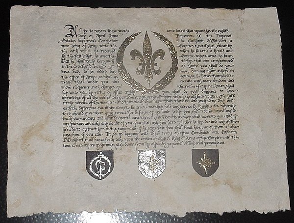
This scroll would be in recognition of
the creation of the new Laurel King of Arms of the Empire of
Chivalry and Steel, which would historically have been a
legal document. As such, the illumination was confined to
the registered heraldic arms of the Empire and Kingdoms.
Since this is an Imperial office, the Imperial device was
centered in the middle of the piece, to serve as the main
focal point, with the Arms of the three kingdoms across the
bottom. The heraldic design not only serves to illuminate
the scroll, but the three kingdoms arms act as ratifying
seals for the kingdoms which the Laurel King of Arms watches
over. Historically, the office of King of Arms held great
importance within a Kingdom, and to amplify the implied
stature of the patron I decided that the illumination should
be done entirely in gilding and ink.
The
Materials
Foundation
Before the common use of paper as a
writing surface, indigenous peoples of the world recorded
information on genealogy, religion, divination, and
government on many different natural substances such as
rocks, leaves, and fabric. Long strips of tree bark,
sometimes as long as thirty feet, were also used to record
information. The first record of paper is in China circa 105
AD. However, recent archaeological investigations place the
actual invention of papermaking some 200 years earlier.
"Early Chinese paper appears to
have been made by from a suspension of hemp waste in
water, washed, soaked, and beaten to a pulp with a
wooden mallet. A paper mold, probably a sieve of
coarsely woven cloth stretched in a four-sided
bamboo frame, was used to dip up the fiber slurry
from the vat and hold it for drying. Eventually,
tree bark, bamboo, and other plant fibers were used
in addition to hemp". (IPST website)
It took nearly 500 years for papermaking
to travel from Asia to Europe, by way of what’s modernly
referred to as the Middle East. Many Chinese papermaking
materials, such as rice and bamboo, were not available to
Middle Eastern papermakers, who substituted flax and other
plant fibers instead. They also developed a human-powered
trip-hammer to prepare the pulp.
Although the export of paper from the
Middle East to Byzantium and other parts of Europe began in
the 10th and 11th centuries, the craft was apparently not
established in Spain and Italy until the 12th century. Early
paper was disfavored by the Christian world as a
manifestation of Moslem culture at first. Paper was so out
of favor (being a product of Godless heathens) that, in 1221
the Holy Roman Emperor Frederick II declared all official
documents written on paper to be invalid. It is possible
that this decision was made under the influence of wealthy
sheep and cattle merchants, who feared losing the income
from their parchment trading. (IPST website)
People typically think of medieval
manuscripts as being vellum or parchment that was produced
by the preparation of sheep, goat or calf hides. The truth
of the matter is much different: wood-pulp paper was very
uncommon in general use. However, by the thirteenth century
paper was available for use in book production. Although it
is considerably less durable than natural parchment, paper
had, and still has today, one great advantage: it’s
enormously more cost effective. By the fourteenth century, a
variety of papers were readily available to anyone who
needed them for a reasonable price. (Clement, 8)
For it’s beauty and durability, the Oath
of Laurel King of Arms work has been rendered on natural,
unbleached bark paper, which was made in a fashion similar
to the period European paper that was made from linen rags.
To ensure ease of use, I finished the
paper with a light dusting of a fixative called "pounce".
Used frequently in period, pounce consists of finely ground
pumice stone and gum sandarac. Pounce fills in minor
imperfections in the writing surface. This helps the gilding
compound adhere to the page and reduces feathering of the
ink across the page. (Seligman,
18)
Gilding
All the tastes and purposes that medieval
artisans served made the use of metals an integral part of
the technique. Of all metals used in period illumination,
gold was the most significant, not only for its ability to
suggest power, richness and splendor, not only for its
color, luster and permanence, but for all of them together.
The term "illumination", in fact, comes from an older term
meaning, "to decorate with gold". (Blackwolf) The medieval
illuminator, along with his patrons, joined in an enthusiasm
for this precious metal that resulted in some of the most
charming effects in the painting of the Middle Ages.
The technique for gilding has changed
little since the Middle Ages even though new and less
expensive materials have been created for today’s society.
This piece uses modern gilding foil, rather than 23k gold
leaf and real silver leaf for a number of reasons. The time
and cost constraints did not allow for the purchase the
natural materials through mail order, and there is no local
outlet for such things. Also, though silver gilding was used
in period works, it tarnishes very badly in a relatively
short time. This resulting in what we see on many period
manuscripts pages today: large messy black masses corroding
the page. So, in order to keep the aesthetic appeal of the
document consistent, modern foil gilding was deemed to be
the best option for the work.
Ink
Many recipes that can be found today for
ink have their roots deep in the Middle Ages. Most forms of
ink were obtained by suspending black pigments in another
medium such as wine or egg whites and honey. Some black
pigments included in these were charcoal and bone-black,
which was obtained by burning bone in the absence of oxygen.
Gall inks, which first go on a dark gray and richen in color
with time, were also frequently used in period because of
their permanence and dense black color . Because the bark
paper absorbs such a large amount of the ink, for this work
I used a modern India ink. India Ink is far 'blacker' than
most of the early medieval inks (Leofwine), but better
suited for the nature of this piece.
Production
Text and Calligraphy
The text of this piece was derived from
the Black Book of the Admiralty, which is one of the
works selected to be part of the Rolls Series of
primary sources for English History. Though slightly out of
period amongst the pages of the Black Book can be
found timeless Oaths of Office for Pursuivants, Heralds, and
Kings of Arms. As many of the functions of office that
applied in period, are not seen in the modern Empire, the
period text was modified to fit the duties of the ECS office
with changing as little of the original oath as possible.
Laurel and I did our best to keep the spirit of the text
while still tailoring it to the needs of the Empire. The
text of the scroll reads as follows;
"All ye to whom these words come
know that upon this the eighth day of April Anno
Imperium X, the Imperial Estates does make Conchobar
mac Gabhann O’Cuthbert a new King of Arms unto the
Empire. Laurel shall swear by the oath which he
received when he became a herald and by the faith
that he owe the Empire whose arms he bear, that he
shall truly keep such things that are compromised in
the articles following.
1st, as Laurel you shall do your
true duty to be every day more cunning than others
in the office of Arms, so that as you may be better
furnished to teach those under you, and execute with
more wisdom and more eloquence such charges as the
realm of any nobleman shall lay unto you by virtue
of office.
2ndly, you shall do your
diligence to have knowledge of all the nobles and
gentlemen within the Empire, which should bear coats
in the field in the service of the Empire, and them
with their issue truly register, and such arms they
bear, with the difference due in the arms to be
given, and they hold any service by knight’s fee,
whereby they should give their King service for
defense of his land.
3rdly, you shall not be unwilling
to teach pursuivants and heralds, nor to ease them
in such doubts as they shall move to you, and if any
pursuivant asks any doubt of you, you shall ask him
first, whether he has desired any of the heralds to
instruct him in the same, and, if he says you, you
shall limit him one of them, or else ease him if you
can.
In so as keeping with these terms
of office Conchobar mac Gabhann O’Cuthbert shall
hence forth take upon the crown of Laurel, King of
Arms of the Empire until the time comes where as he
must step down from his office by personal or
Imperial persuasion".
Once the text was chosen, I picked a hand
that I wanted to work in. The Littera Bastarda hand was
developed in the mid-13th century from the need
for a more functional and readable script. There are many
variations in this script, which makes it difficult to
document. Often, one could find several different styles of
this hand in the same city, mixed in with established hands
of the earlier years, and expressive cursive elements from
over the course of three centuries. Though commonly used for
a considerable amount of the Gothic period, ultimately the
difficulties of reading of Littera Bastarda left it to be
abandoned for simpler Renaissance letters. I wanted this
piece easily read, so I left out many of the ornamental
qualities that this hand sometimes has and decided to keep a
simpler easily read generic "blackletter" form.
I began this project with a quill but
soon found that it wasn't easily used on this paper, because
of the texture of the surface. Therefore, I switched to a
steel nibbed dip pen to complete the calligraphy, and used a
finer nib to draw out the heraldic devices. To add to the
elegance of the calligraphy I used a final stroke on some of
the letters that creates the curling adornments to the base.
This curl is achieved by twisting and lifting the pen as you
finish the stroke so that nothing but the very tip of the
edge touches the paper. Though the letter adornment was very
difficult to achieve upon the bark paper base, the finished
effect was successfully rendered.
The Illumination
After completing the calligraphy, the
first step in illumination of the piece was gilding. First,
I painted the adhesive size in a flat layer with a #1 sable
brush onto the page in every place that I wanted the foil to
stick. After the size was dry, a sheet of foil is exposed
from the package. Gently turning over the foil, it is
exposed and then pressed onto the size. Finally the leaf is
pat down on the surface with a soft brush and then finished
to a shine with a piece of parachute silk.
After lying down the first layer of
leafing, the process was repeated to cover any areas of
inconsistent or inadequate coverage. The bark paper absorbed
much of the gilding base, and most of the piece has three or
more layers of the foil. The rough surface of the paper
significantly affected the gilded finish, giving a textured
appearance to it, even after multiple layers of the
adhesive. As period gilding can be found in many forms other
than the typical rounded leaves with a mirrored finish, I
felt the way this texturing of the illumination played with
light added a charming and interesting addition to the
overall design.
Colophon
The scribes and secretaries of the Middle
Ages left us a left us a detailed and often humorous
reminder of their toils scribbled into the margins of pages
in the form of the colophon. With comments on production
ranging from the quality of the vellum, to the aches and
pains in their backs, colophons give us a unique look at the
mind of the medieval scribe, and what went into the
production of their glorious pages.
With that I must say that I am thrilled
at the striking beauty that is this finished scroll. The
simple elegance of the gilded illumination set against the
natural bark paper makes this piece a stunning highlight to
my portfolio. Striking and bold, the piece is not only an
exercise in fine calligraphy and illumination, but conveys
the spirit of an ancient document. The goals that I set out
to accomplish with it were not only met, but also far
surpassed.
Banik, Prof. Gerhard; "Ink Corrosion",
http://www.knaw.nl/ecpa/ink/html/inkco.html
Bayard, Tania; "A Medieval Home Companion,
Housekeeping in the 14th Century", Harper Perennial,
New York, 1992
Buziak, Cari; "Gilding",
http://www.aon-celtic.com/cgilding.html
Blackwolf, Master Gordon; "Gilding",
http://www.mtsu.edu/~kgregg/dmir/06/0605.html , 1984
Cennini, Cennino d’Andrea; "The Craftsman’s
Handbook", Dover Publications, New York, 1954
Clement, Richard W.; "Manuscript Books",
Online Reference Book for Medieval Studies,
http://orb.rhodes.edu/encyclop/culture/books/medbook1.html
de Hamel, Christopher; "A History of Illuminated
Manuscripts", Phaidon Press Ltd, London, 1997
Drogin, Marc; "Medieval Calligraphy: Its History
and Technique", Dover Publications Inc., New York, 1980
Grafton, Anthony; "Rome Reborn: The Vatican
Library and Renaissance Culture"
http://metalab.unc.edu/expo/vatican.exhibit/exhibit/Main_Hall.html
, 1993
Karne, Cynthia; "Making Iron Gall Ink",
http://www.knaw.nl/ecpa/ink/html/make.html
Leofwine and Yffi; "Quills – Part 3; Ink",
Regia Anglorum Publications, 1995,
http://www.regia.org/quill3.htm
Levin, Craig; "Late Medieval Oaths for Kings of
Arms", 1996,
http://www.chronique.com/Library/MedHistory/oaths.htm
MS UCB 120, Catalonian circa 1031, The Bancroft
Library, University of California, Berkeley,
http://sunsite.berkeley.edu/catalan/
MS UCB 125, Catalonian circa 1539, The Bancroft
Library, University of California, Berkeley,
http://sunsite.berkeley.edu/catalan/
Seligman, Patricia; "The Illuminated Alphabet",
A Quatro Book, Running Press, London, 1994
Ravenscroft, Margritte of; "Period Inks",
http://www.mtsu.edu/~kgregg/dmir/06/period_inks.html
Thompson, Daniel V.; "The Materials and
Techniques of Medieval Painting", Dover Publications, New York,
1956
|