Week
One
http://www.fox.com/house/
"Official network site. Includes cast and crew information, message board, and episode guide."
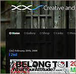
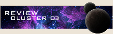
Those familiar with House M.D. know Dr. Gregory House as a character who is a blunt and straight to-the-point type of guy with his patients, all while keeping you interested in the meantime with his colorful wit. I feel that this also best describes the official website for the TV series as well.
Normally I could care less about any website related to my favorite TV shows. They usually provide nothing that I could'nt get out of watching commercials or browsing TV guide. However, if all shows did what House does for it's website, things would be different.
The site showcases videoes, imagery, and much more content for past, present, and future episodes; getting viewers and visiters alike to look forward to upcoming episodes through use of streaming previews and a message board full of any news related to the series.
The site's overal appearance is nearly synonmous with it's content; simple and to the point, with no overbearing color schemes or poor image use.
While the message boards could use a bit of a cosmetic facelift, they still get the job done efficiently.
Pros:
-Highly interactive
-High-res imagery
-Supports most popular browsers without a problem
Cons:
-Message Boards are crude and simple compared to the rest of the site
-Some parts could use a bit of proofreading

Week
Two
http://www.worldofwarcraft.com//index.xml
"The official site containing news, trailers, gameplay videos, wallpapers, screen shots, and the official forums."
I may be a bit bais, being a player of World of Warcraft, but regardless, it's websites like this that make me enjoy my gaming experience even more when you see a company's devition to thier product reflected on thier website.
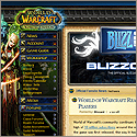
At first glance, you can tell there's a lot of content to absorb. For those unfamiliar with the game itself, there are various "Game Guides" to help explain just what the heck all this stuff stands for and means.
For players of the game, veteran and newcomer alike, the site offers a variety of useful tools and resources to help guide your way through the mechanics and gameplay. Interactive interfaces allow you to customize your character's progression as they advance in game.
Visually, Blizzard Entertainment rarely dissapoints, and the website is yet another example of thier attention to detail. Beyond just exceptional use of colors, type, and amazing imagery, you can sometimes stumble upon a hidden message or "easter egg"-like content.
My only complaint comes from the random chance that Firefox will crap out on certain pages. This is a non-issue in Internet Explorer, however. Still, it can be annoying.
Pros:
-Highly interactive
-Easy to use navigation
-Ability to "hide" unused navigation
-Lots of pretty pictures
Cons:
-Occasionally some features have trouble with non-IE browsers
Week
Three
http://www.penny-arcade.com/
"Equal parts comics and commentary, Penny Arcade features Tycho and Gabe, the alter egos of creators Mike Krahulik and Jerry Holkins."
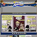
Penny-Arcade is a webcomic written and illustrated by two gamers, which focuses mainly on video games, the video game industry, and gamer culture. These web comics are accompanied by a daily chunk of blog posts on the main page. Penny Arcade is one of the most popular gaming web comics currently online, and even hosts a children's charity and gaming convention every year. The site also offers a forum for people to exchange ideas.
At first glance, you can easily figure out how to navigate the site and view the archives of old content.
However, if anything is in need of work here, it is the overly simple graphics and general visual design of the site. I would have expcected some great artists as themselves to create a layout that was a bit more "wow". Also, searching for previous comics needs some form of advanced search, as it is a pain to spend hours hunting for that really good strip when the titles have nothing to do with the actual strp.
Pros:
-Simple and clear navigation
-frequently updated
Cons:
-Not as good of a visual design as it could be?
-Archive search needs more options
Week
Four
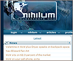
http://nihilum.mousesports.com/en/news/
"Nihilum.eu - MMORPG Gaming Guild and Community."
Nihilum is an international computer gaming organisation and home of the MMORPG guild Nihilum.
The guild was established in late 2004 by a group of EverQuest and Lineage 2 players.Their first claim to fame was in 2006, when as a relatively unknown guild, they were the first to make worldwide news with thier accomplishments. Since then they have been at the forefront of endgame raiding claiming 21 world firsts out of a possible 30 in 'The Burning Crusade' expansion alone. And we intend to continue this high performance with the upcoming release of World of Warcraft’s second expansion: ‘Wrath of the Lich King’
Since its humble beginning as a simple DKP list in the dark alleys of the internet, the website has developed into a platform for the pure enjoyment of MMORPG’s. A place for us to share back our experiences with the community that has given us so much.
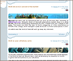
The inital appearance of the website is very divided and organized; easy to navigate and figure out the order of things. The amount of content and vast community within such a small-scale website is impressive.
At times, the blue/white color scheme is a bit distracting, and some of the graphic work could use tweaks - although overall the site is visual moderate and not too overdone in the main content pages. The forum community works exceptionally well, although the technology behind it could use more options - though no doubt the fault of the 3rd party coder of the forum developer.
Pros:
-Excellent navigation
-Simple but impressive visuals
-frequently updated
Cons:
-Some pages are distracting in color use
-Forum technology could use tweaks
Week
Five
http://v08.pdmb.org/
"Just a weblog."
I stumbled across this page while I was reading up on some CSS information. Usually, the first thing I notice about the foriegn websites I come across are the unfamiliar characters and illegible (to me) text all over the place. However, this weblog caught me off guard, as the crisp and visual appearance stole my inital impressions.
Since then, I have fallen in love with the appearance of this site.
Beyond the language barrier, the navigation is easy to understand, and the content is equally clear (except for the page with the dog and little girl - I'm still trying to figure that one out). Getting around is made even easier by the various buttons that jump to certain features or topics on a designated page. It's a shock when you can actually push the button labeled 'top' and it does indeed do what it says - on every browser.
The visuals are where the site really shines, and as a weblog for an artist, one would
assume this is how it should be.
Normally I just view heavy darks/black style websites as trendy and an easy-way cop-out, but this time I'm impressed with how the designer lets the dark design flow with the rest of the site's visuals.
I do however, question why a few of the pages in the navigation seem to link to pages with a completely different layout and style than the rest. I can look past at least one of the pages as it appears to be an archive of the previous design for the site - a homage, if you will.
Pros:
-Excellent navigation
-Impressive visuals even with a dark theme
Cons:
-questionalble lack of consistency on a handful of pages