Keeping Your Page Clean
– One of the greatest differences that can be
noticed between a beginning scribe and one with more
experience is the ability to keep their page clean.
No matter how long you practice the art you will
find yourself struggling against the fates for a
perfect page. The difference is often in the tricks
of the trade, and everyone has their own artistic
customs. Here I offer you some tips and ideas for
keeping your page clean.
- Wash your hands before you begin
to work.
- Wear fingerless gloves. The
therapeutic type for sewing work
well.
- Use permanent ink.
- Let your surface dry before
covering it again with paper.
- Don’t have food near your
workspace.
|
- Cover the areas, which aren't
being worked on with blank sheets of
white paper.
- Situate your water and paint in
a place that you cross your page
with a wet brush as few times as
possible. (e.g. right side if your
right handed, left side if your left
handed)
- A scraper /burnisher is your
best friend.
|
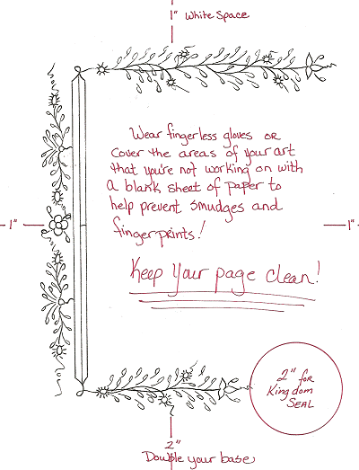
White Space 1x1x1x2 – Though the final
destination of your work will usually be unknown, it
is the custom in the MidRealm to provide adequate
space for framing. The term generally used for this
framing room is " white space". In order to keep the
correct visual perspective of the piece the equation
used to determine white space is 1x1x1x2.
Take your ruler and lay it evenly down the left
side of your paper, lightly draw a line down the
edge. Next do the same with the other 3 sides.
Across the bottom edge you will lay the ruler
against the bottom white space and create a double
width along the bottom. No matter what width you’re
using, always double your base.
Your illumination should not cross into
the allotted white space. However if you do go
slightly past the edge into your white space, don’t
panic, it'll be okay.
Illumination Space – After you have
your white space sectioned off, you should take your
ruler and your pencil and draw in the borders of
where your illumination will be. The project for
this class is a simple ľ border from the 15th
century Netherlands. You should create space for
your illumination on the top, bottom, and left hand
side. Sketching in these borders will help you not
allow your illumination to flow into the calligraphy
space.
Kingdom Seal Space – A 2" Round space
should be left on your page to accommodate for the
Kingdom Seal. Space for the seal can be worked into
your illumination or fit into the calligraphy area.
Wherever you chose to place it, mark the spot
lightly in pencil with the word "seal" so that the
signet knows what was provided for in your design.
For this piece we'll be leaving room for the seal
in the bottom right corner of the Illumination
space. Pencil in the 2" round to be centered to your
bottom illumination.
The
Illumination - This
border was inspired by a leaf from a Dutch Book of
Hours which was purchased by Dame Merouda Pendray.
Her examination of the leaf and images of the
original can be found online at:
http://www.geocities.com/CollegePark/Library/2036/dutch.html
I find this style of illumination an excellent
place for people to start in C&I due to the freedom
and natural expression in the pen strokes. The
leaves and stems DO NOT have to meet precisely nor
does the painting have to be perfectly in the lines.
Creating a medieval feel to the work is what the
artist should strive for.
Using the example provided below create a bar at
the left-hand edge of your illumination space,
closest to the calligraphy space. This bar needs to
be separated into blocks for three colors, red and
blue sharing on side of the bar, gold down the other
side of the bar. From the top and bottom points of
your bar you should draw a free flowing stem, from
left to right. The stem should end with a three
pointed leaf. Flowing also from left to right, your
stem should have an array of small green leaves
emerging from it. Berries should be painted in gold.
For the illumination on left side of the border
find your center point and draw a small four-petal
flower with a few leaves coming out of it. Above and
below this flower around the quarter points should
be a berry stem coming off of your bar with vines of
green leaves running vertically.
Your rendering does not have to be exact to the
border example. Use your creativity, and let your
pen flow. HAVE FUN!
 |